
The Evolution of the Conteas Crown
Some logos are created. Others are inherited. The Conteas crown belongs to the second category.
As we researched the history of the brand and assembled an archive of original Conteas watches spanning more than six decades, one fascinating detail emerged. While cases, dials and typography evolved with changing tastes, one symbol remained at the heart of every watch. The crown.
Its design changed over time, yet it never lost its identity.
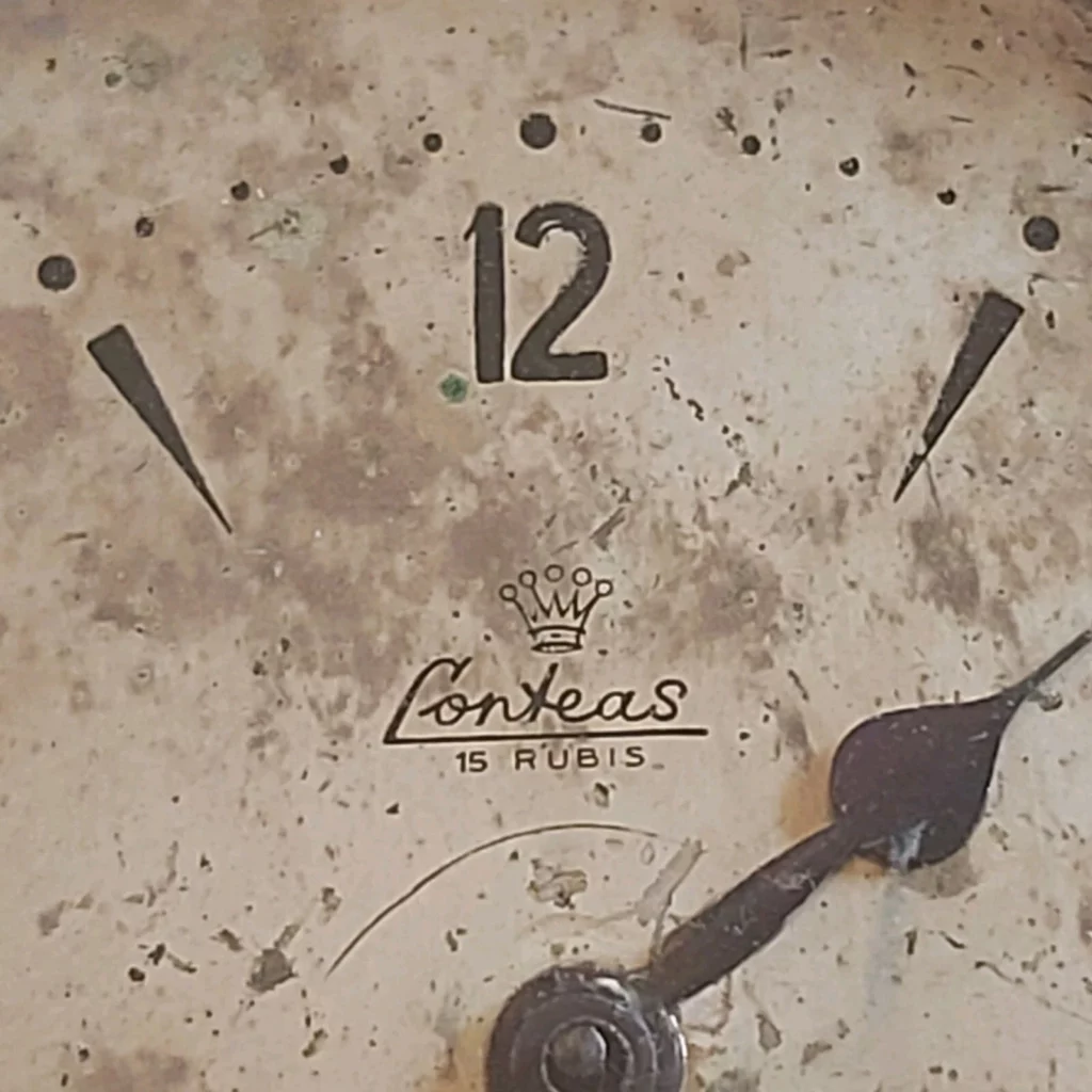
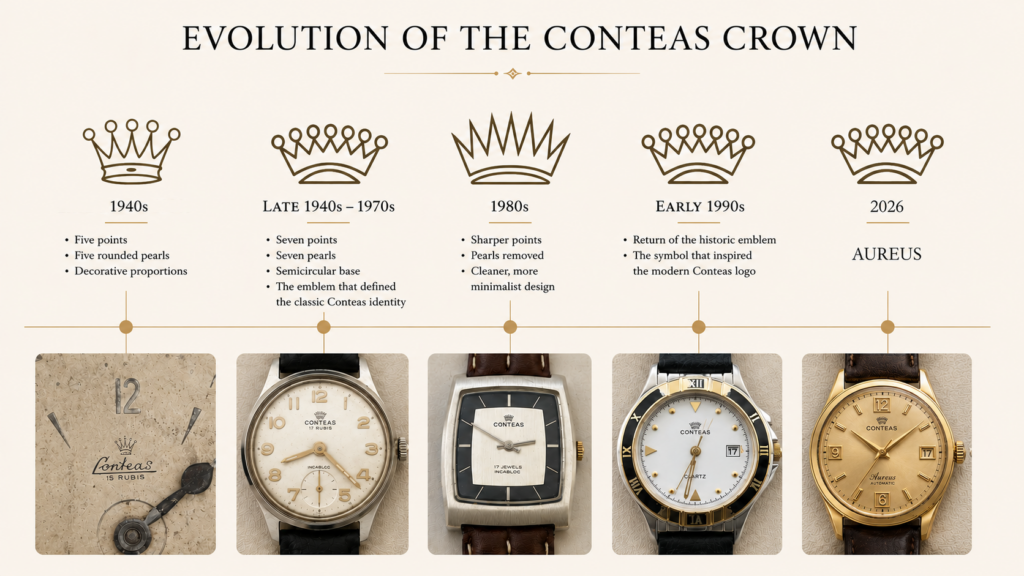
Across almost fifty years of documented production, the Conteas crown evolved without ever ceasing to be unmistakably Conteas. The earliest known Conteas watches, dating from the 1940s, already carried a distinctive crown above the signature. Elegant and decorative, it featured five points ending in rounded pearls. Even in its earliest form, it was more than a simple logo—it was the visual identity of the brand.
By the late 1940s, the emblem had reached a new level of refinement. The crown adopted seven points instead of five, each ending in a rounded pearl, while its base became a graceful semicircular arch. The proportions were more balanced, the design more harmonious. This version would accompany Conteas throughout the 1950s and 1970s, becoming the emblem most closely associated with the brand’s classic era. It is this crown that we consider the purest expression of the Conteas identity.
Like every watchmaker, Conteas evolved with the changing aesthetics of each decade. In the 1980s, it was simplified once again. The rounded pearls disappeared, the points became sharper, and the emblem adopted a cleaner, more minimalist appearance. Despite these changes, its identity remained immediately recognizable. Interestingly, one of the last known Conteas quartz watches from the early 1990s features a return to the historic emblem introduced decades earlier. Whether intentional or not, this choice reconnects the brand with one of the most recognizable symbols of its history.
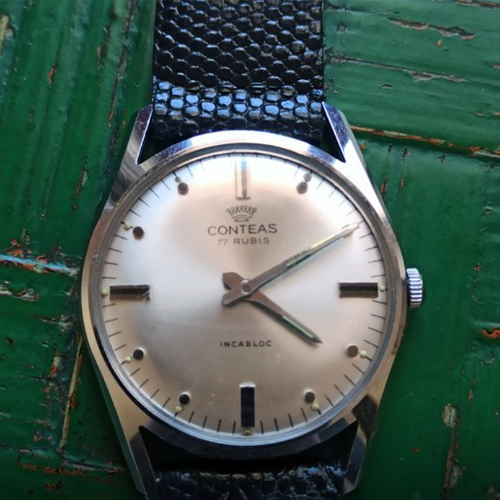
When the time came to revive Conteas, our decision was remarkably simple. We did not create a new logo. We chose to preserve the emblem that had accompanied the brand through its finest decades.
The crown that appears on every modern Conteas watch is directly inspired by the classic design of the 1950s and 1960s—a symbol that had already represented Conteas for generations. History cannot be redesigned. It can only be respected.
Did you know?
The modern Conteas crown is not a contemporary creation. It is directly inspired by the emblem that appeared on Conteas watches throughout the 1950s and 1960s—one of the defining periods in the brand’s history.
Swiss Heritage. Reimagined.